ReviseiMedia
Website Design / Website Development
Website Design and Development...
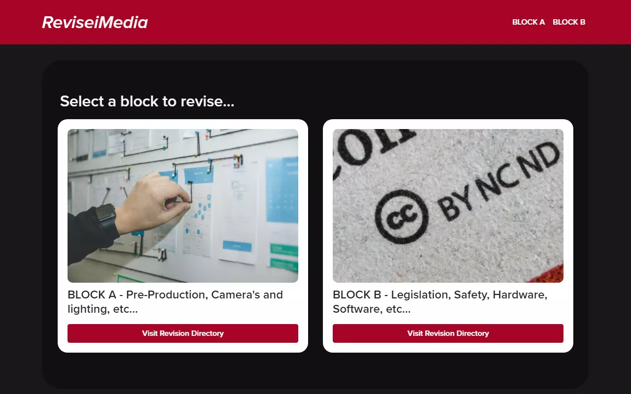
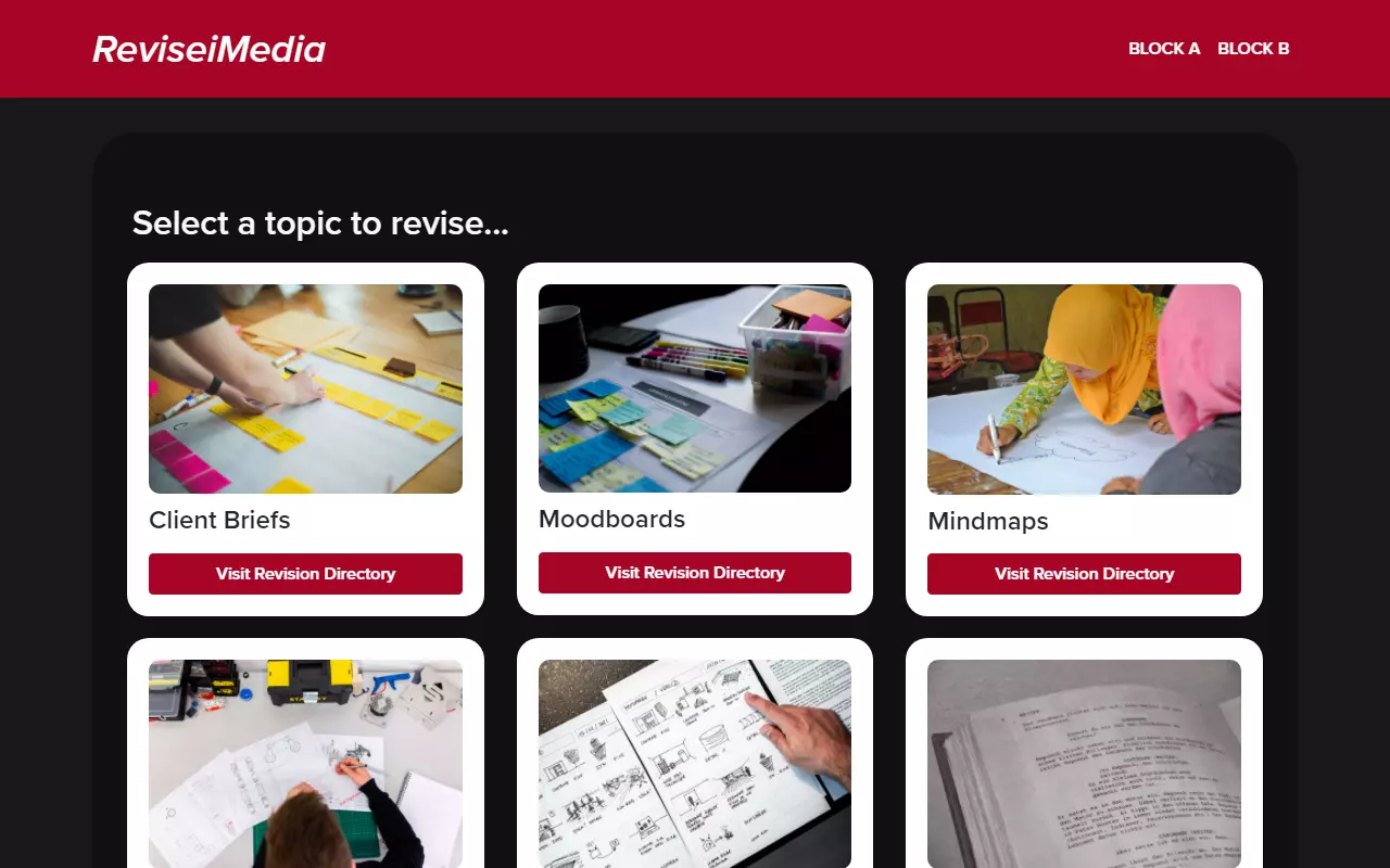
When approached to build the ReviseiMedia website we were asked to make it minimalistic and easy to understand/navigate. From the beginning of our design process we decided a dark colour theme would be best fitting as we considered this site would be used for late night revision and that students wouldn't want a harshly bright theme for that use.
Selecting a layout was something we worked hard on to make each section strongly visually represented, while also being easily navigable. Card-like blocks were chosen for this in order to make each section clear and recognisable in a block together. This decision was made to ensure that all of the different topics were accessible and effortless to locate, meaning all the more time to revise and prepare in time for exams!
When providing information on the topics covered in the R081 module that we were instructed to cover, MJDWS and the client mutually agreed to keep things simple to leave no room for distraction, simple text blocks enabled for us to provide the information completely as provided in a simple and legible manner allowing for the content to be easily digestable by the user.